
The small business sales and marketing organization approached our team as a part of the "Small Business Go Big" initiative with the simple ask of, "how can we make a better customer experience through our online channels?". That's it. No requirements or pre-defined solutions. It was then up to us to discover why the current experience was not living up to our customer's expectations, and experiment with solutions to solve for it.
We were a cross-functional agile team consisting of 1 designer, 1 product manager, and at one point up to 10 engineers. Being the designer on the team it was up to me to gather research, lead the team through all synthesis and exercises, build and test prototypes, and feed a backlog with designs.
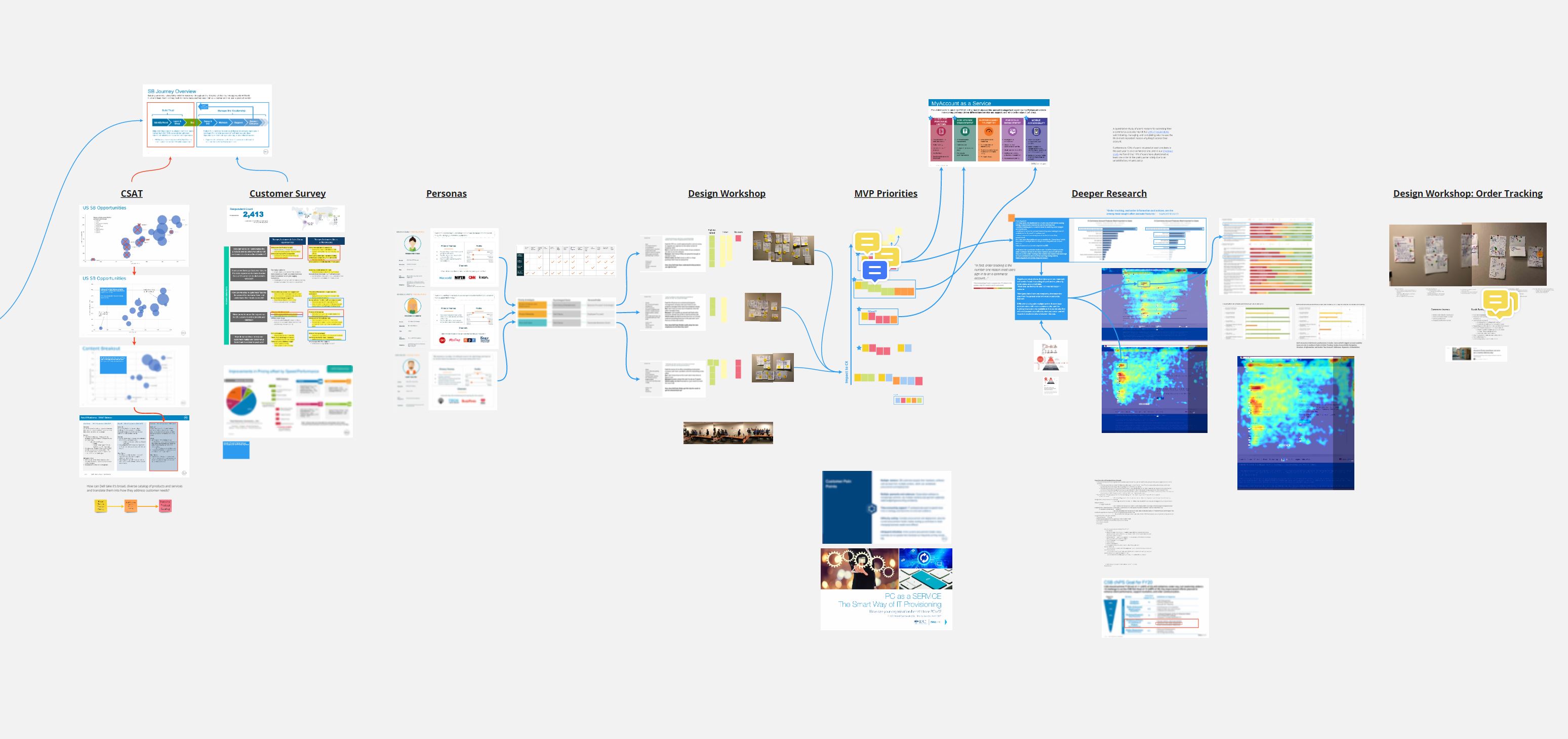
From the beginning of the discovery phase of the project we knew we had tons of data at our disposal and didn't need to conduct an exhaustive amount of generative user interviews. A rare thing, but it saved us a lot of time. This data included CSAT (customer satisfaction) scores, sales survey responses, 3rd party persona, analytics, you name it we had it. The trick was going to be making sense of it all.
After careful synthesis it was pretty clear that account management was a major source of pain for customers and had the highest impact to CSAT scores. More specifically order management topped the list of main reasons why a customer would need to manage their account. So that's where we began.

After conducting a quick design workshop with the team and pulling together similar ideas it was then my task to build an MVP prototype for testing. Our first test was to preview a customer's recent orders on their dashboard without making them navigate to an order history page. This was unanimously delightful to our test participants and became our first iteration. We next tested an easier to use Order History page which also tested much better than the current state. This became iteration number 2.

After launching these two iterations we noticed a 72% drop in the Order History button click through rate. This was due to the fact that users likely only needed to see the last 2 orders to complete their purpose of visit. On the Order History page itself, with the addition of a "Buy it Again" button we saw a 61% conversion rate for those that clicked on it, generating almost $200k in revenue in just a month. That's quite a bit of money for such a low cost feature!
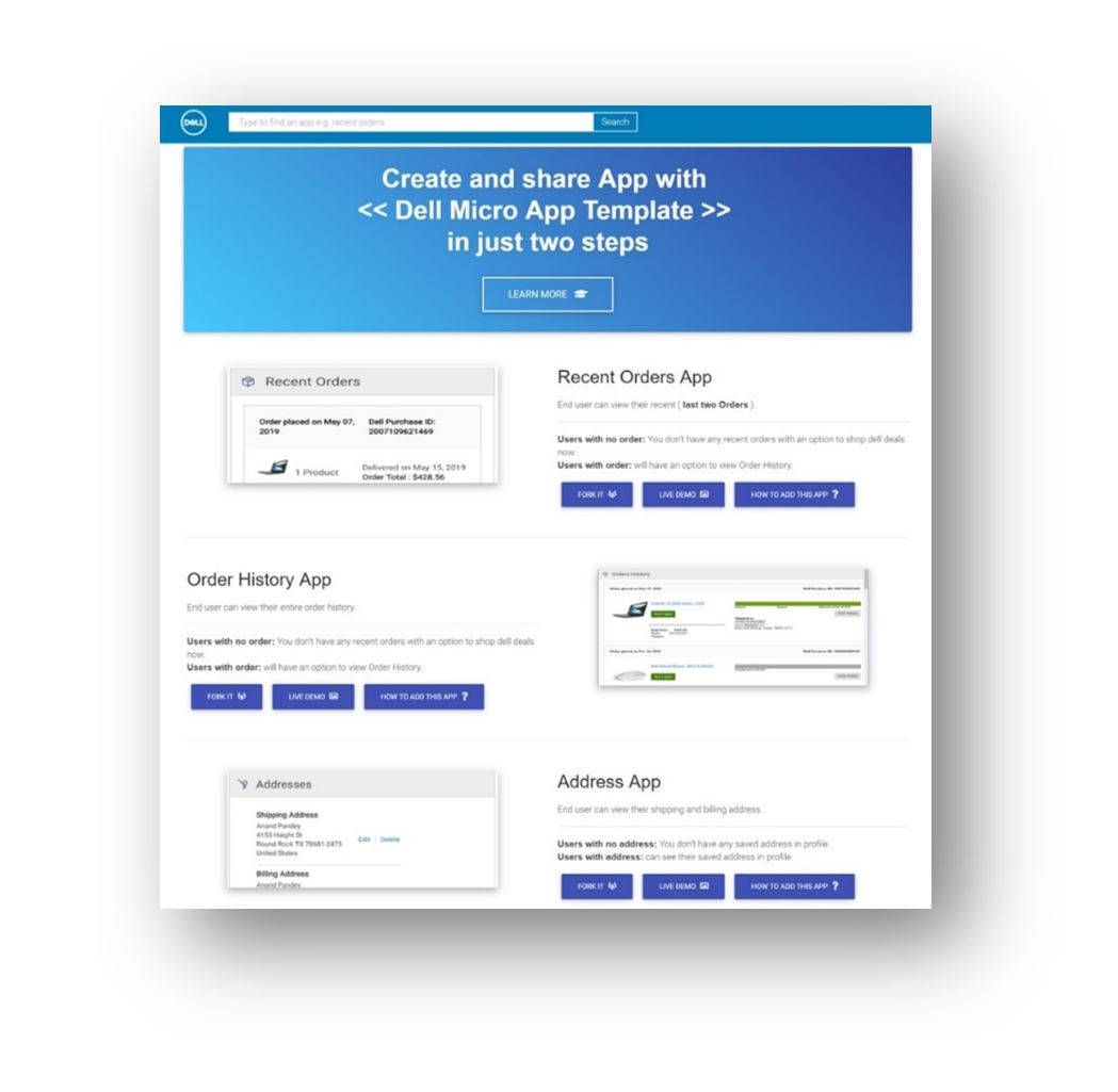
At the time there was an organization-wide transformation to move away from large, monolithic code bases to micro front end applications hosted in PCF. Out team adopted this from the beginning and while I was conducting discovery and framing the engineering team was making this migration and setting up our CI/CD (continuous integration, continuous deployment) pipelines. Once this was done it would allow the team to deploy and/or regress as often as possible which in tern allowed me to continuously iterate on the experience concurrently.

While the engineering team was chipping away at the backlog for the previous 2 iterations me, my PM, and my Engineering lead wanted to take a fresh look at what best in class account experiences were like and beat them. We first noticed that almost have of the top 60 ecommerce sites in the US and UK utilized a side navigation vs. the "card" style we had at the time. We also found that site that offered rewards programs featured them very prominently on the page which we did not.
After testing we found customers all preferred these two key features which validated our assumptions and hypothesis.
